Thursday, 2 December 2010

Exaggeration

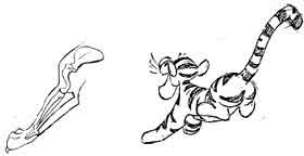
Because animation, despite the technological advances of CGI these days, still doesn’t quite mimic the reality of emotion on a character unlike a live action piece could, exaggeration is used to characterise it. There needs to be an element of balance within it to avoid too unrealistic actions, comedy when not intended or just general “over animating”, but if done well the audience understands the emotion as it is intended.
The example of exaggeration using Cartoon Network’s Road Runner and Coyote demonstrates the use of exaggeration where appropriate for its intention. The frantic leg spinning of the chasing Coyote, the smoke billowing from the feet of the Road runner, the coyotes tongue hanging out and his eyes bulging in excitement of catching his prey creates the comical element the makers were after, where as if Cartoon Network hadn’t exaggerated and decided to be as realistic as possible, well… that would be just down right boring and seemingly emotionless on both character parts.

Exaggeration: Road Runner and Coyote - Cartoon Network

Luxo Jr

Staging

The idea of staging within animation is to keep the viewer informed or aware of what is the main focus in a scene using techniques such as the focus on a particular character, the set up of the scene itself or interactions between characters or objects to create a feeling or emotion. It is a visual informative that guides the viewer to what is supposed to be the centre of attention in that particular scene. Too much going on in a scene can distract a viewer from what the main focus should be, but with good staging an audience is aware of what the main focus in a scene should be.
The example below shows staging based on interaction between characters and "expression" of the characters leading the viewer to know what to focus their attention on. The father figure in Luxo Jr is originally in the centre of the frame keeping the audience attention on him, as the rolling ball comes into frame he follows it with his head encouraging the viewer to also focus their attention on the ball. As he knocks it out of the frame it also informs the audience that there is potentially another character off screen. As the second character bounds on to screen the father figure who is still central in the shot follows his son's movements with his head diverting the attention off himself and therfore encourages the viewer to focus their attention on the son.

Thursday, 25 November 2010

Appeal

Audiences like to see a quality of charm, pleasing design, simplicity, communication, or magnetism. A weak drawing or design lacks appeal. A design that is complicated or hard to read lacks appeal. Clumsy shapes and awkward moves all have low appeal. In creating an appealing pose for a character, one thing to avoid is called "twins", where both arms and both legs are in the same position, doing the same thing. This creates a stiff pose that is unappealing. Vary the parts of the body a bit, including the facial features, makes a character more appealing.


Secondary Action

A secondary action is an action that results directly from another action. Secondary actions are important in heightening interest and adding a realistic complexity to the animation.
If a secondary action conflicts with, becomes more interesting, or dominates in any way, it is either the wrong choice or is staged improperly.

Straight ahead action and pose to pose

Straight Ahead Action in hand drawn animation is when the animator starts at the first drawing in a scene and then draws all of the subsequent frames until he reaches the end of the scene. This creates very spontaneous and zany looking animation and is used for wild, scrambling action.


Pose-to-Pose Action is when the animator carefully plans out the animation, draws a sequence of poses, i.e., the initial, some in-between, and the final poses and then draws all the in-between frames (or another artist or the computer draws the inbetween frames). This is used when the scene requires more thought and the poses and timing are important

Tuesday, 23 November 2010

Cycles


Walk cycles are created frame by frame. They are a sequence of images in which link back to the beginning. A walk cycle consists of a moving character and one stride can usually take 8 frames.
Walk cycles are one of the hardest things to master however when achieved u can use the other principles to enhance rhythm, force, mass and other such attributes.
Eadweard Muybridge first began to break down the stages of walk cycles in 1872 when he investigated whether all four of a horse's hooves are off the ground at the same time during a gallop; his most famous work of the horse in motion. He then went on from this to break down movements of other animals and the human figure. Looking into rhythm and movement you are able to break down the body's anatomy and shape a great help in recapturing realism in animation.

Squash and Stretch


Squash & Stretch is used in animation do add emphasise and effect. It is a technique applied to an object or character in motion. It is mainly used in cartoon animation for exaggeration. Its use adds fluidity to make movements look more realistic.
Squash and stretch can be use to emphasise expression and bring focus to a particular part of the animation.

fanart.lionking.org
 for objects movement it can add fluidity and ceate a realistic approach it adds weight to the object ass it moves.

foundationsofanimation.wordpress.com


Timing

Timing in animation is mainly made up of 24 or 25 frames per second. Timing assimulated how quickly or slowly movement take place.

 Timing can determine the mood and realism of the film.  If done correctly in can impose weight and power to an object. Without good timing an animation can fall apart, having a very fast walk can appear as a run or no movement at all.

Eadweard Muybridges photographs enable us to break down elements of movement however putting these images together without timing can loose the action visiablity.